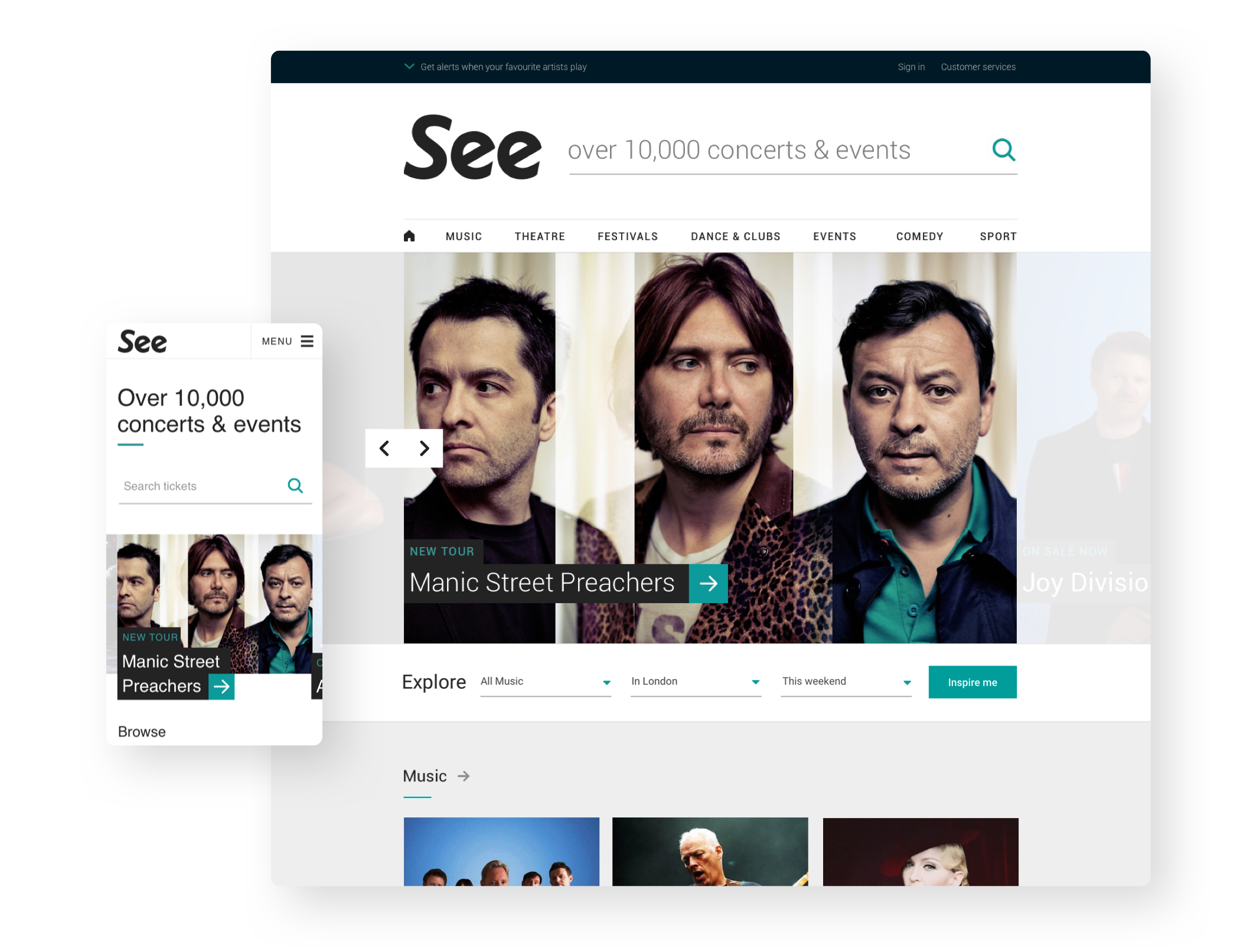
Working as part of the design team at Mace & Mentor, I developed a refined interface and design system that was rolled out across the platform as part of a wider service update with a strong emphasis on search and discovery..
A digital first brand
I worked to update the previous brand and UI with an emphasis on digital accessibility and typographic hierarchy, producing a clean and reductionist interface that allowed the content to take centre stage. Through simplifying the interface and number of steps needed we were able to drastically reduce our time-to-purchase metric and the overall conversion rates of the checkout.
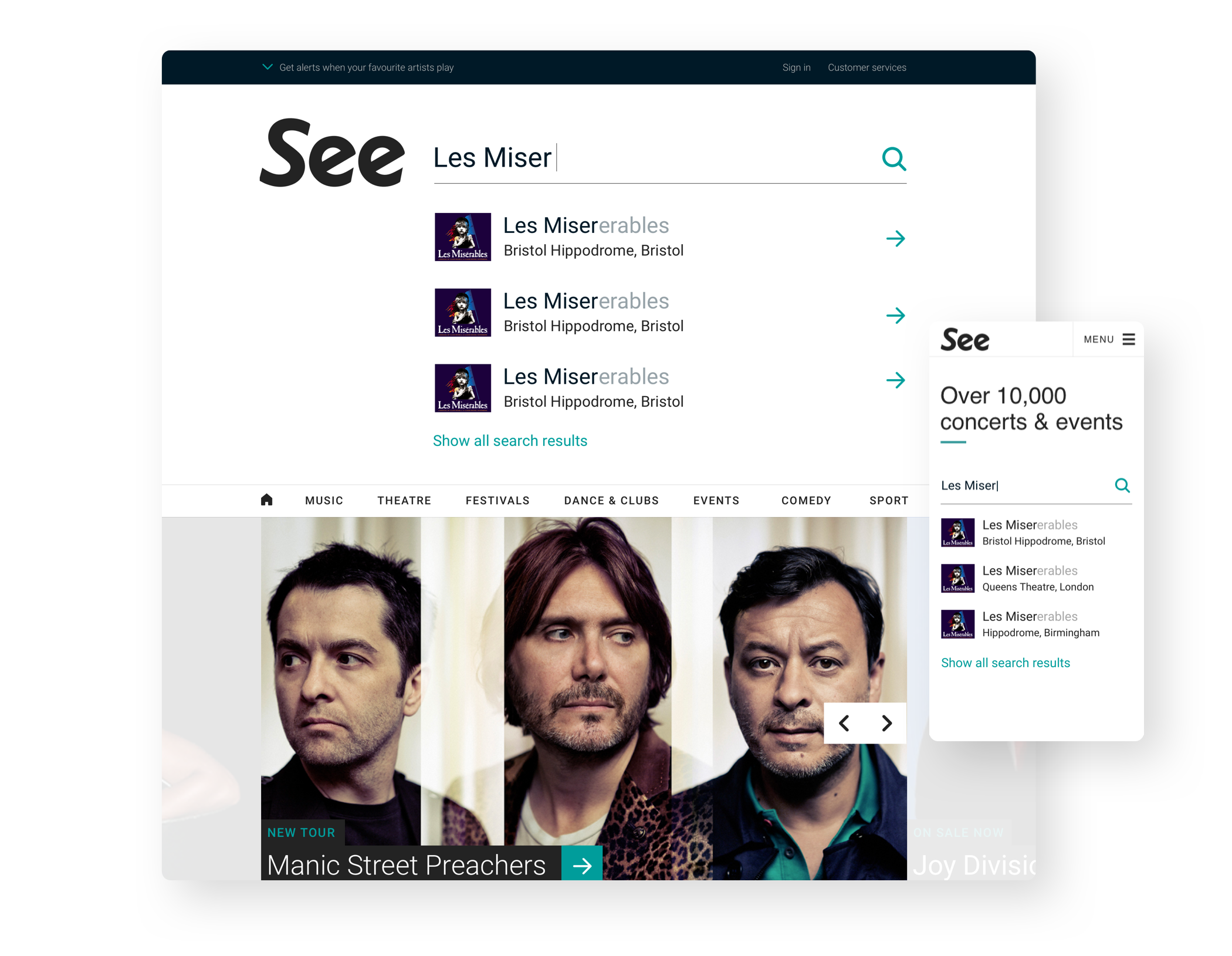
Suggestive search
We knew from our data that search was the key entry point for users who started their journey from the home page. We spent time optimising this experience by implementing auto suggestions that highlighted key information. This drastically decreased traffic to the search results page, increasing traffic to event pages.
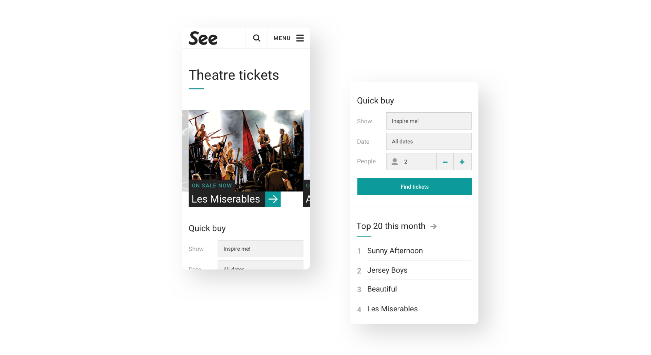
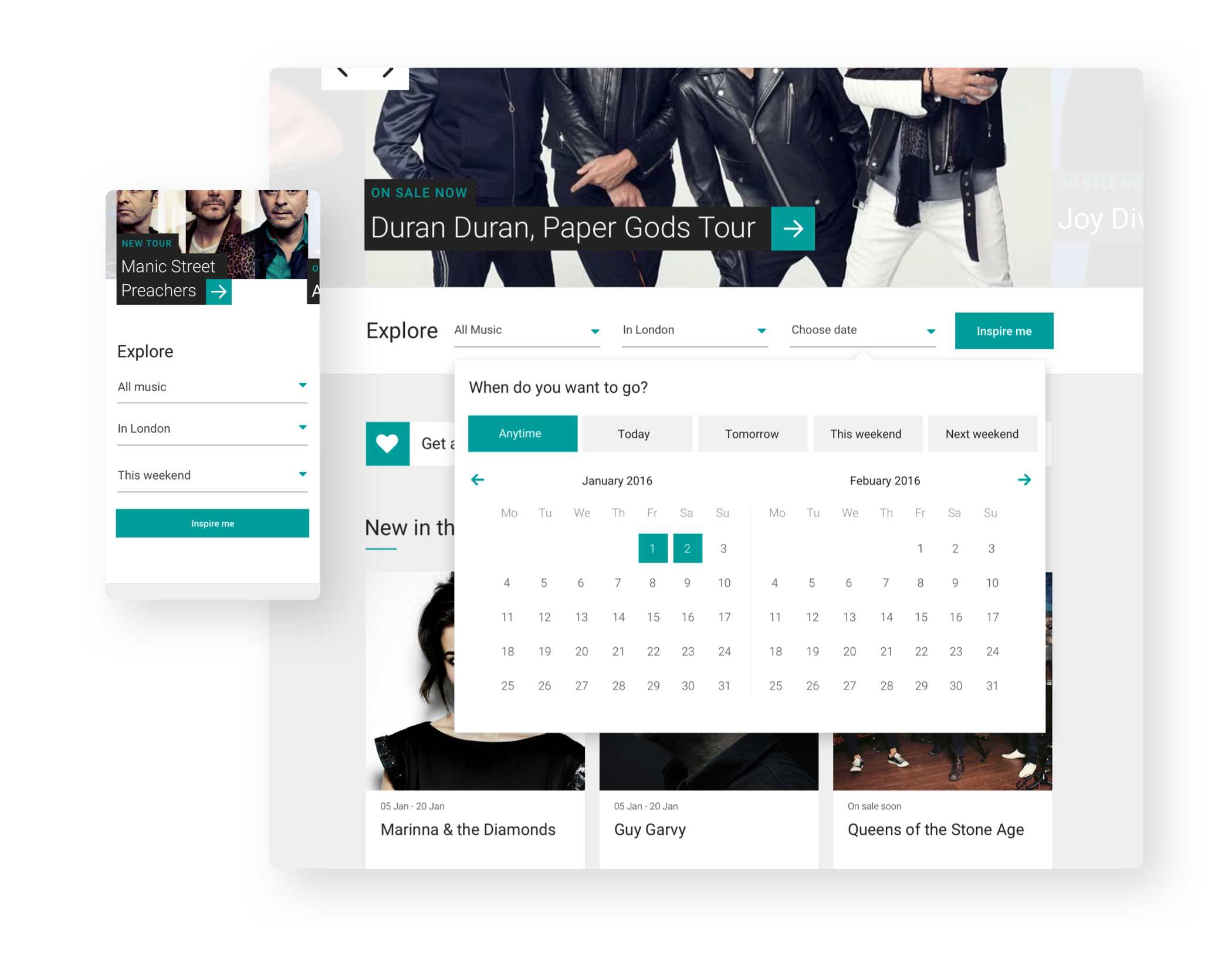
Kick starting discovery
We saw from testing and user research that not enough was being done to kick start the discovery process. We refined the entry points for browsing content by implementing a new ‘Inspire me’ feature that allowed users to quickly jump in and start exploring based on location, date and event type.