Deliverables:
Art direction
Interaction design
Interface design
Background
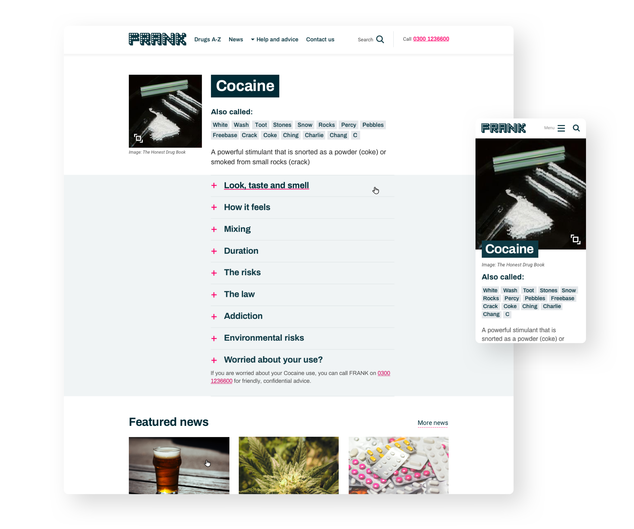
Talk to Frank is an impartial drugs advice platform operated by Public Health England (PHE). I worked as part of an agile team at cxpartners as art director and interaction designer on the redesign of the platform. We were briefed to completely overhaul the sites content from ground up as well as update it’s outdated brand aesthetic.
A user centred approach
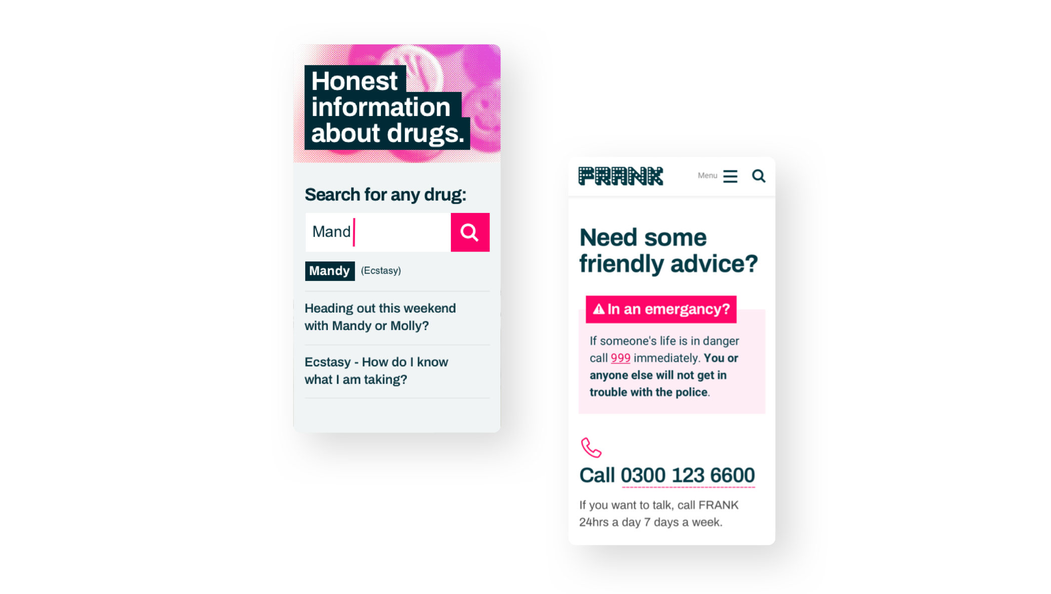
Our approach went through many variations before the final interaction model and aesthetic was settled upon. Each approach was developed and tested with users at each step of its development to ensure we were finding the best possible solutions for our audience.
Lightweight and super fast
Our research told us that a key user requirement was the ability to access the site from locations with unreliable internet connections such as festivals or nightclubs. To achieve this we knew we needed to build a site that was as lightweight as possible in every respect. This design principle was considered in all aesthetic and content design decisions meaning whole pages could be cached for offline access at a later date if data connections were interrupted.
Accessibility first
A huge amount of work was done to ensure that our design, both in aesthetics and structure was as accessible as possible. Testing was carried out with users living with various disabilities such as visual impairments and cognitive fog. We found that both the visual aesthetic and content structure should be paired back as much as possible to meet the needs of these users.
Working with the GDS design system
Being part of the .gov ecosystem meant our design needed to adhere to the strictest possible accessibility standards and design patterns set out by the Government Digital Service (GDS) framework. By contrast, our research told us that our target audience would be less trusting of something which felt like a government site. This led to an interesting design challenge which forced us to experiment and adapt the GDS design system with less polished graphic elements to develop the site’s unique visual tone.