Deliverables:
User Research
UX Design
User testing
Background
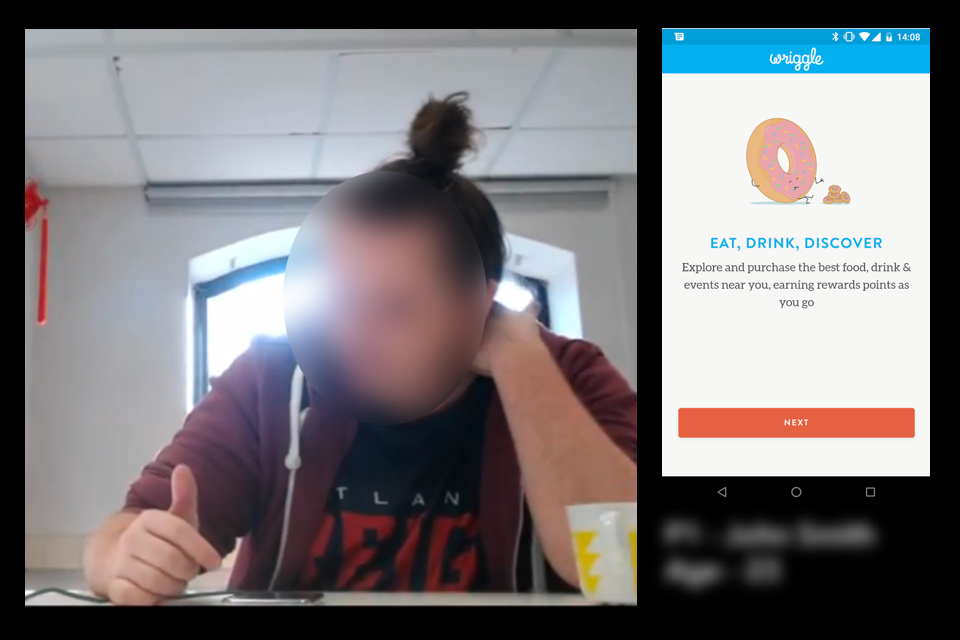
Wriggle is a food and drink discovery app that offers short term deals to customers to help independent restaurant owners increase sales at quieter times. I worked on a number of projects during my time with the start up looking at ways we could enhance the user experience and increase revenue. The work below is one of a series of projects that came from the need to increase our activation and retention rates for first time customers as well as add value by refining and streamlining a user’s first contact with our service.
Understanding our users
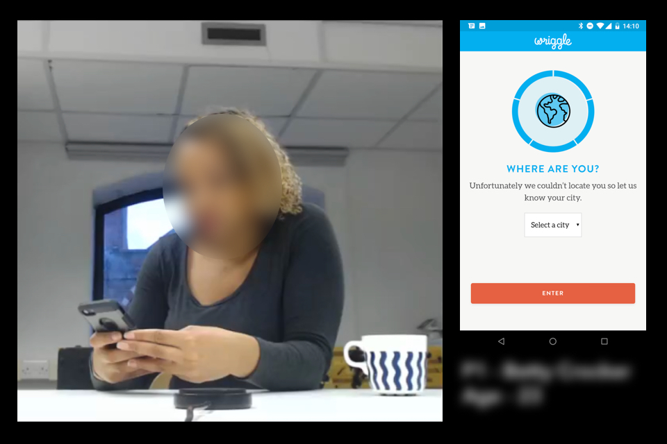
To begin uncovering the story behind some of our sales and retention data I conducted a series of depth interviews with a number of users who had signed up but were yet to purchase (non-activated) as well as some first time purchasing users (activated). My aim was to better understand the wider context of their experience and the triggers behind their behaviour both before and during their use of the app. I also ran a series of user tests on the current platform to begin auditing it’s usability and functionality. These two combine approaches allowed us to spot the flaws in our current system (both on an offline) as well as begin unearthing some of our key user needs.
Finding the AHA! Moment
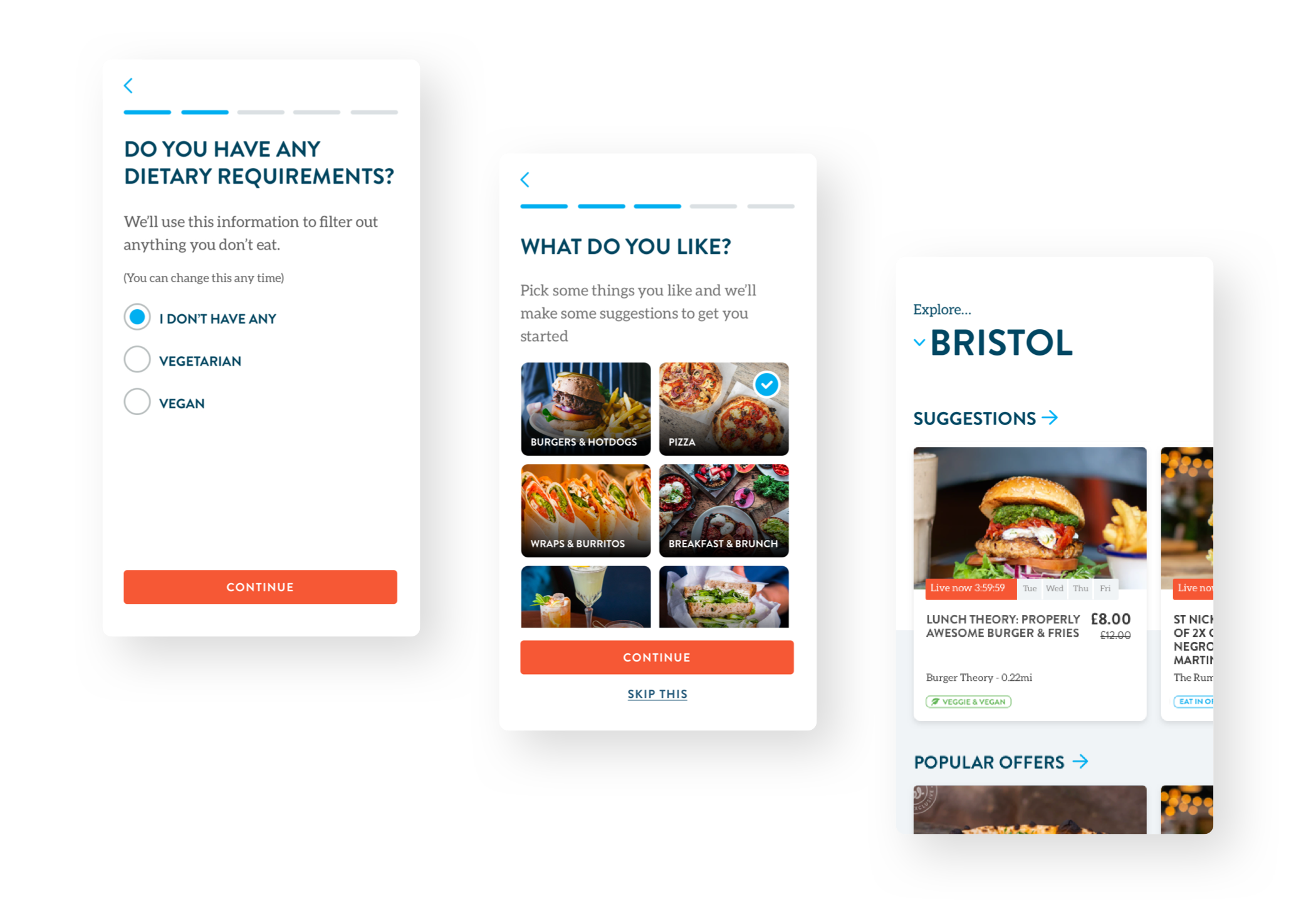
It was clear that, for many users, we were missing our ‘AHA!’ moment. The point at which our users understand how the service works, how they can benefit and ultimately go on to make a purchase. I did a lot of experimentation early on with different user flows and approaches to explore how I could better tailor this initial experience. This then led me to begin producing a series of working prototypes to test with end users.
Increasing activation
I found that we weren’t doing enough to get people to the things they wanted quickly and that the chance of them spotting a product that fit all their purchase criteria within the first minute was immensely slim. I developed an onboarding system that meant we could start to profile users during their first interaction with the platform, allowing us to start tailoring our offering to their specific needs as well as begin building an evolving picture of their consumer habits.
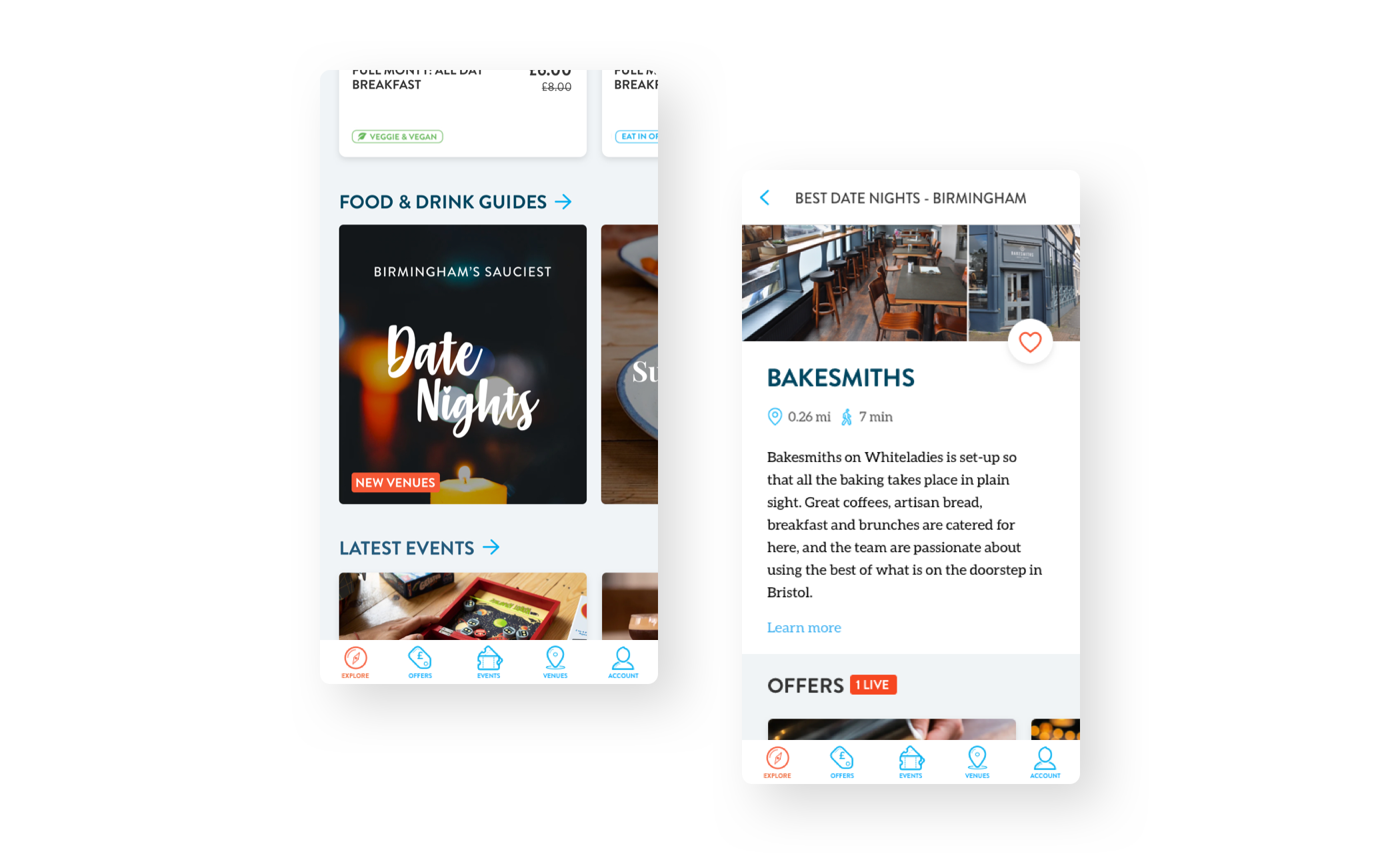
Encouraging discovery
I found that many returning users felt that the platform’s offering soon felt stale and tired after only a few visits. We realised we needed to do more to enhance the discovery experience for returning customers, helping them to find new and exciting offers that they didn’t know were listed. These two polarities of ‘refined’ suggestions and ‘organic’ discovery would go on to become two key guiding design principles for the redesign.
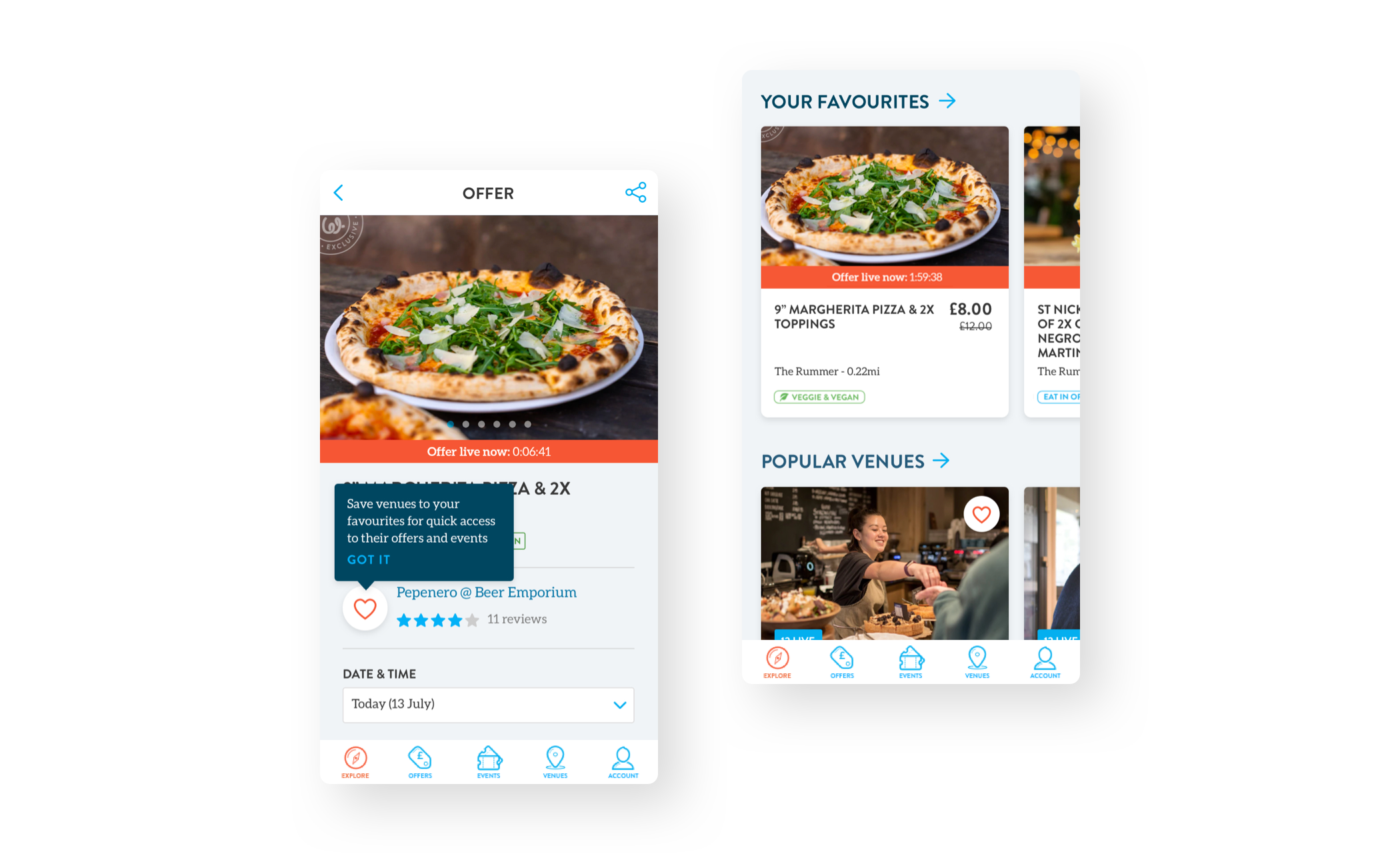
Increasing retention
I found that there was a sizable need from users for the ability to ‘favourite’ or ‘follow’ certain venues they visited regularly in order to get the latest deals as they were listed. This also gave us the starting point for a retention system that meant we could tailor the marketing of similar offers directly to customers based on a growing list of offers and venues we knew they liked.